Typeface for the Tokyo 2020 Olympics based on the most iconic symbol in Japan
About
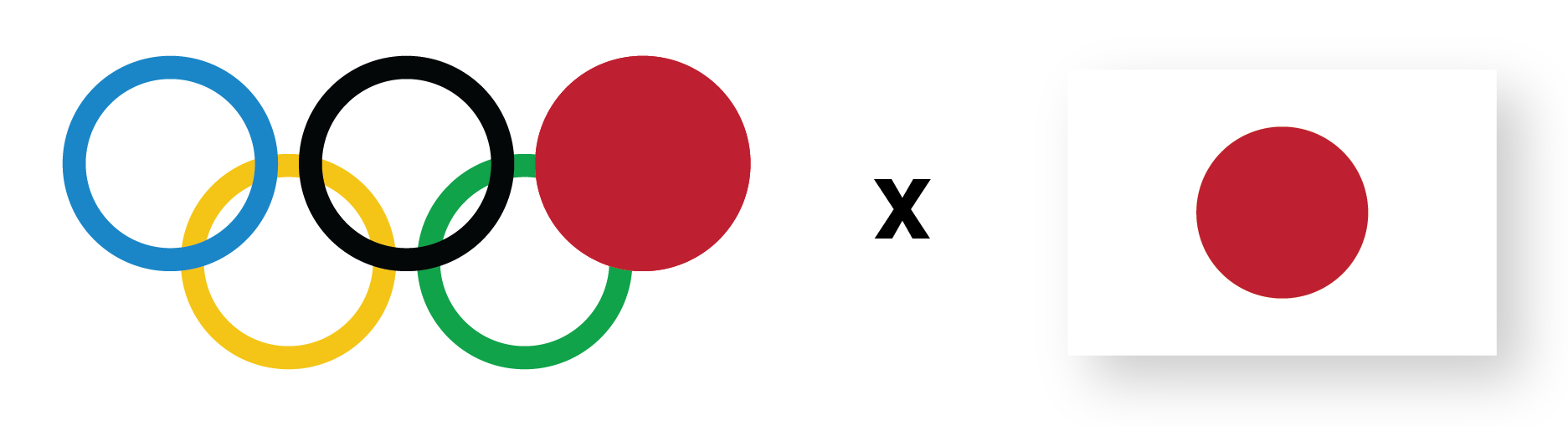
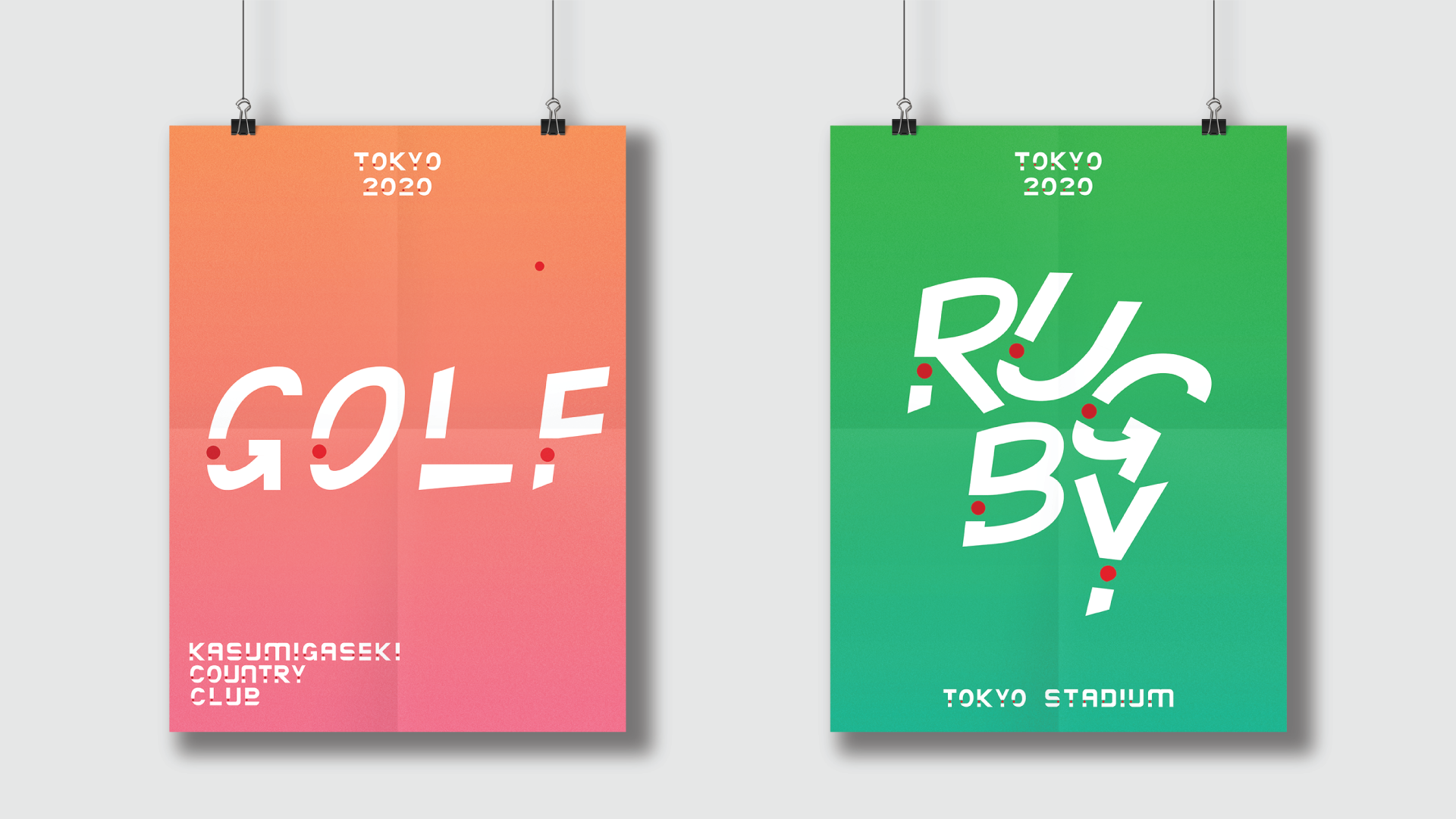
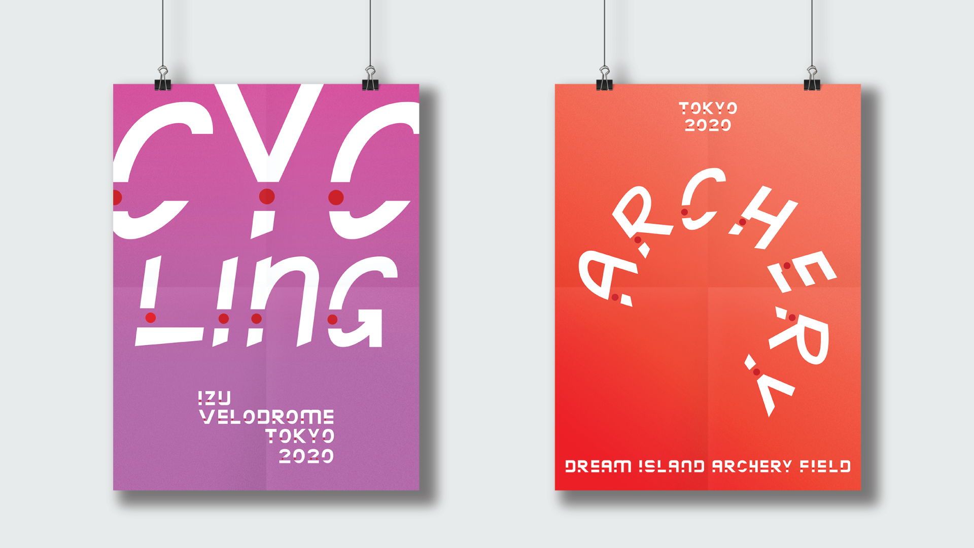
After accusations of plagiarism for the 2020 Tokyo Olympics branding, I created a typeface, based on the most iconic symbol in Japan, which I used for posters for the sports and what venues each sport is played at.
Idea Process
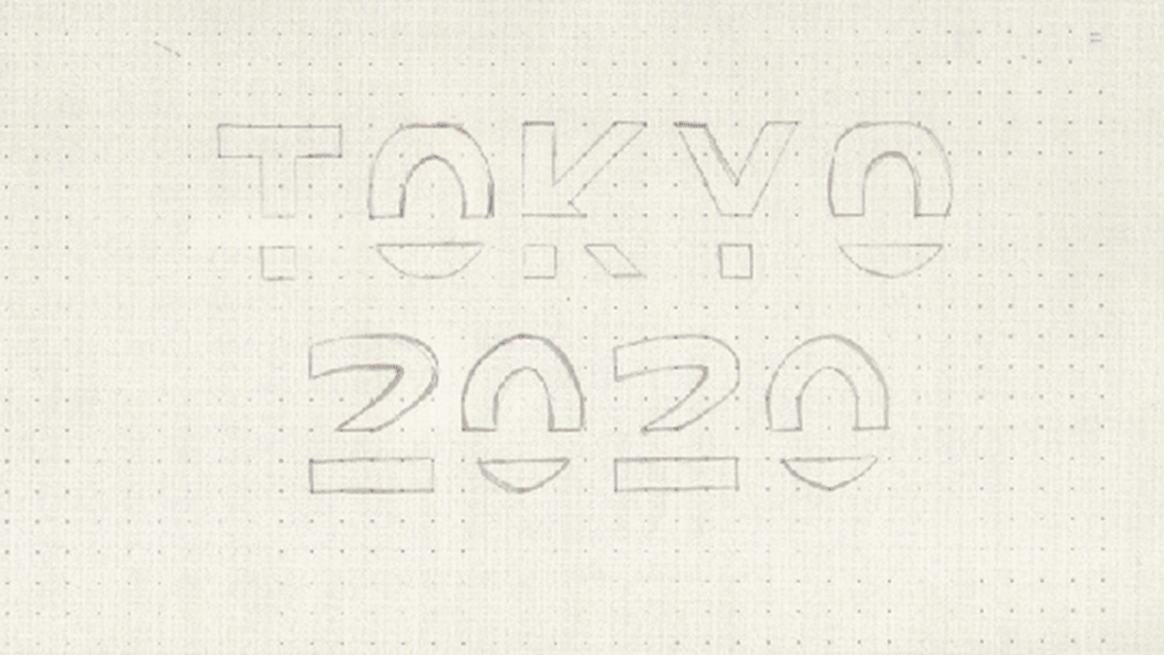
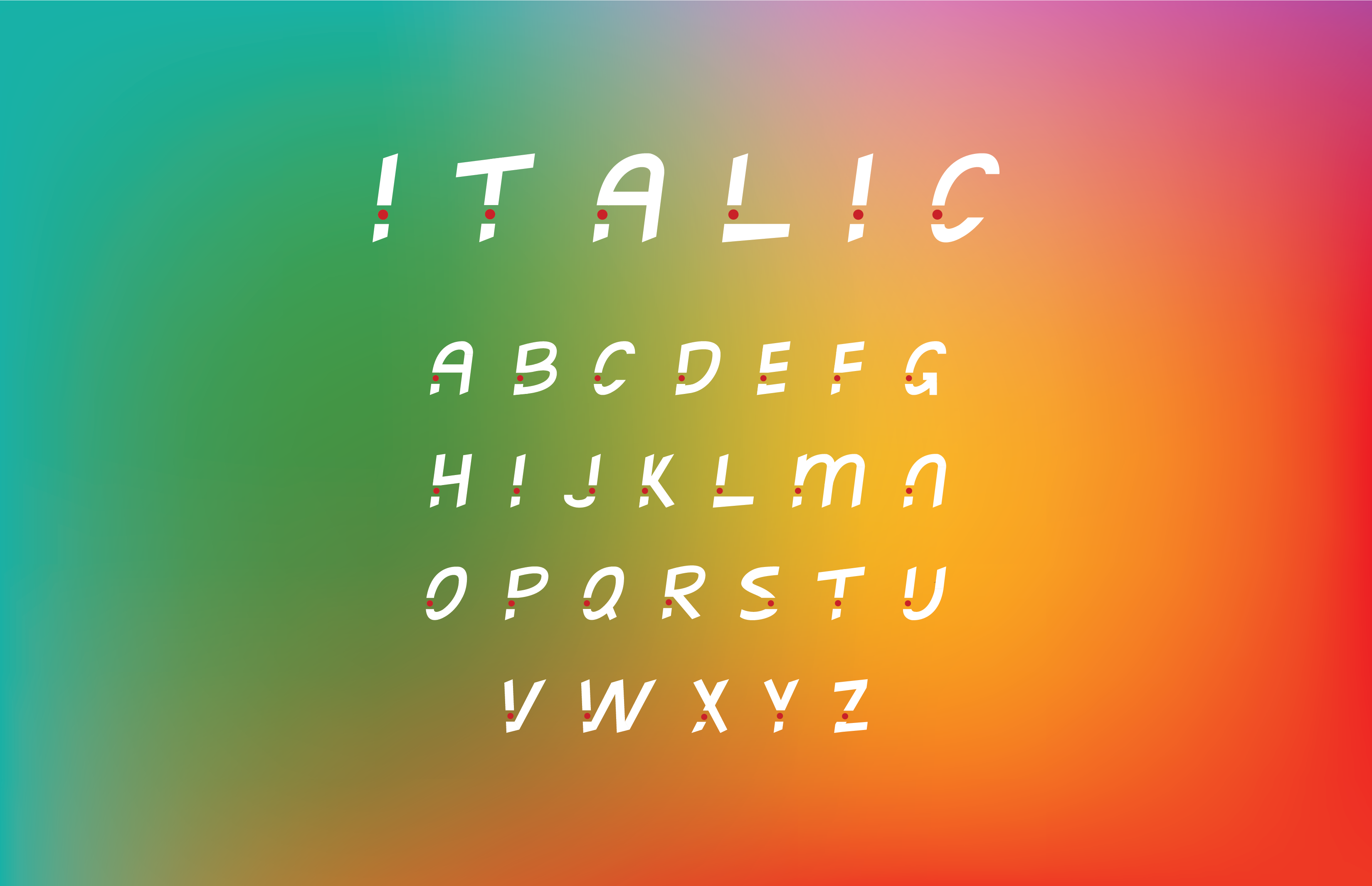
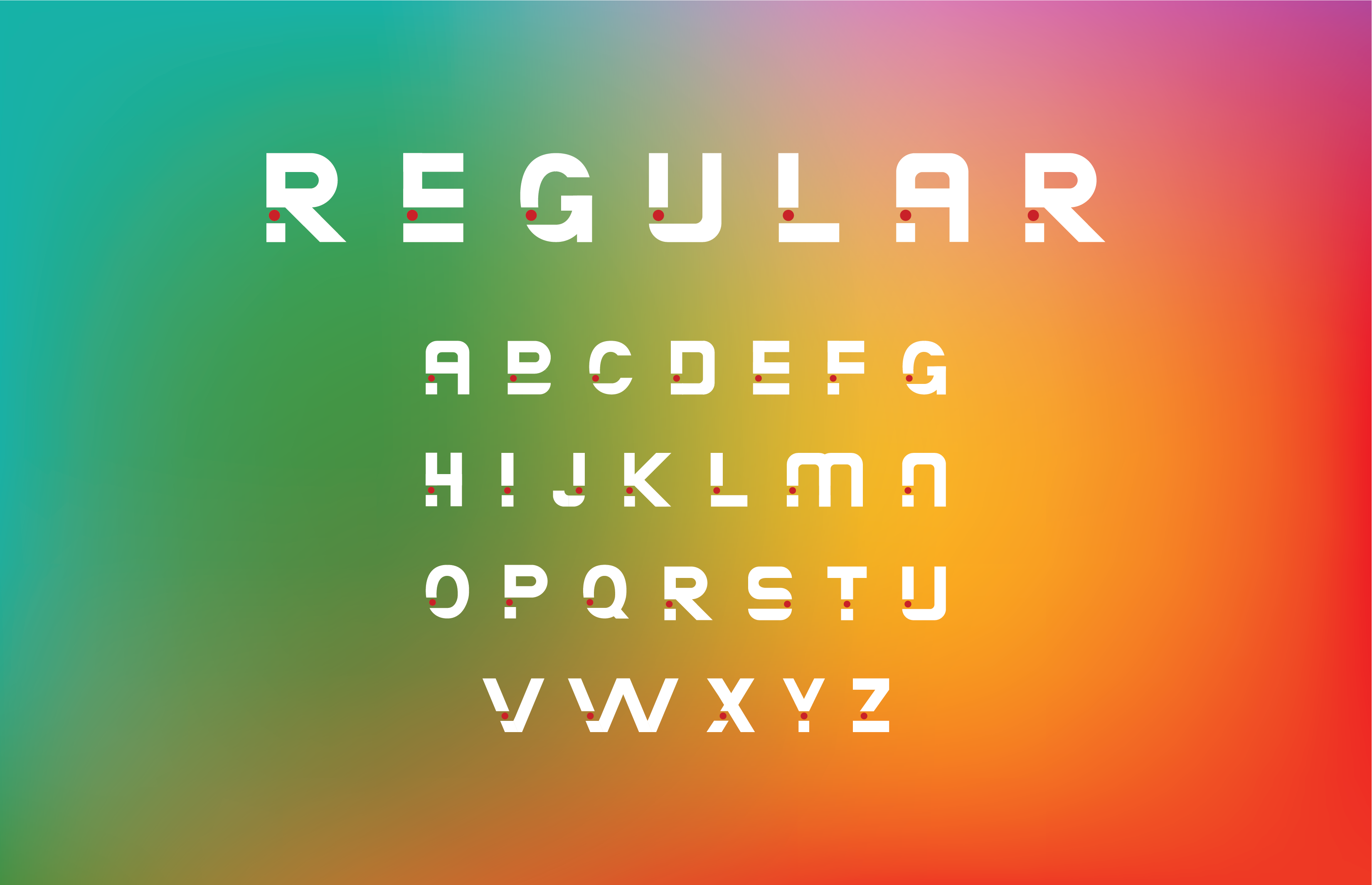
After doing research and starting ideation I soon came to the conclusion of implementing the iconic red dot of the flag of Japan into the typeface. Since it's a typeface for posters and meant to be written in big size, I adjusted the dot into all letters.
Italic Version
The italic version of the Tokyo 2020 Typeface was created to represent the sports of the Olympic games with being more flowing and showing movement.
Regular Version
The regular version is more static than the italic one and is used for the venues, stadiums or fields of the sports.