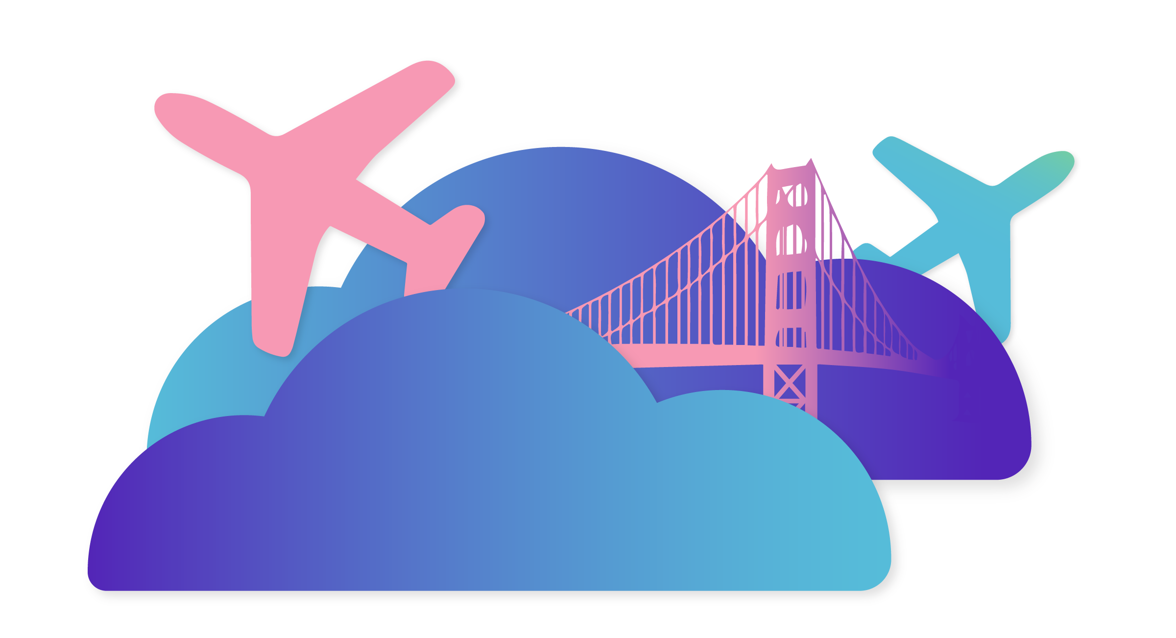
Creating an easier experience for travelers at airports
Project Description
LINEFUL, a start-up company, is on a mission to create an easier experience for travelers at airports, by creating a web application that updates travelers with security line "time of wait" information for different security gates starting with SFO airport.
My Role: Find customer problems and user patterns through interviews, surveys and research with a team of 3 – and then create and deliver a final design solution on my own.
Design Question: How might we build a tangible solution to reduce or possibly prevent people’s waiting time at security gates?
Business Goals
HOW TO CREATE REVENUE?
Gain a small to large user base and look for other business ventures to make revenue. Examples: ad space on the website, partner with small businesses within SFO to drive our customers to their shops (Coupons for coffee), Sell ad space to small SFO business.
Eventually, charge users for this service but not necessary in the beginning.
Scale the service to all airports in California then across America.
Product Goals
RESPONSIVE WEBPAGE
Responsive web application to update air travelers with security line "time of wait" information for different security gates starting with domestic flights at SFO airport.
Have users (air travelers) a create an account and eventually, charge users (air travelers) a small fee (once there's a larger user base).
Eventually look for trends in "time it takes" and give a forecast to people.
Tech Goals
HOW TO MAKE THIS HAPPEN?
First, we are going to pay someone to sit at the airport and feed this information to our app.
Once we validate the business with a small user group, we're going to use our terms & conditions in our sign up sections to have our users agree that when they get to a certain airport and stand in a certain location in the airport (Security Line) we are then going to track how long it takes to get to another location in the airport (end of security line) and broadcast that information back to our application via their internet connectivity. This is how we will scale and replace the human effort.
Personas
THE LIKELY USERS
Before the interviews we assumed that there are 2 target travelers that we will be focusing on – one "heavy traveler" and another "light traveler".
Helena
HEAVY TRAVELER
Age: 30. Occupation: Senior Designer at R/GA. Location: Lower Nob Hill, San Francisco. Desire: Since Helana is constantly traveling between San Francisco, New York and Portland. She would love to be able to get heads up about the security lines at the airports. Pains: Her company doesn’t provide her CLEAR service at airports and usually spends more time at the airport then she wants to.
Lance
LIGHT TRAVELER
Age: 23. Occupation: College Student. Location: Lower Nob Hill, San Francisco. Desire: Noah Travels around 5 times a year, both to Internationally and Domesticly and like spending time in the duty free store, but last time he travelled the security line was so long that he almost missed the flight. He’d like to know when to go to the airport and how long the line is, approximately. Pains: Noah is never sure when he’s supposed to get to the airport and how much time it takes to get through security.
Hypothesis
It often takes people more time to get through the security lines at airport then it took to get them there. In a lot of cases people either spent way much more time at the airport then they need/wish to spend there, or in worst case scenario, miss their flights because of the long security line which could’ve been prevented.
Interviews and Surveys
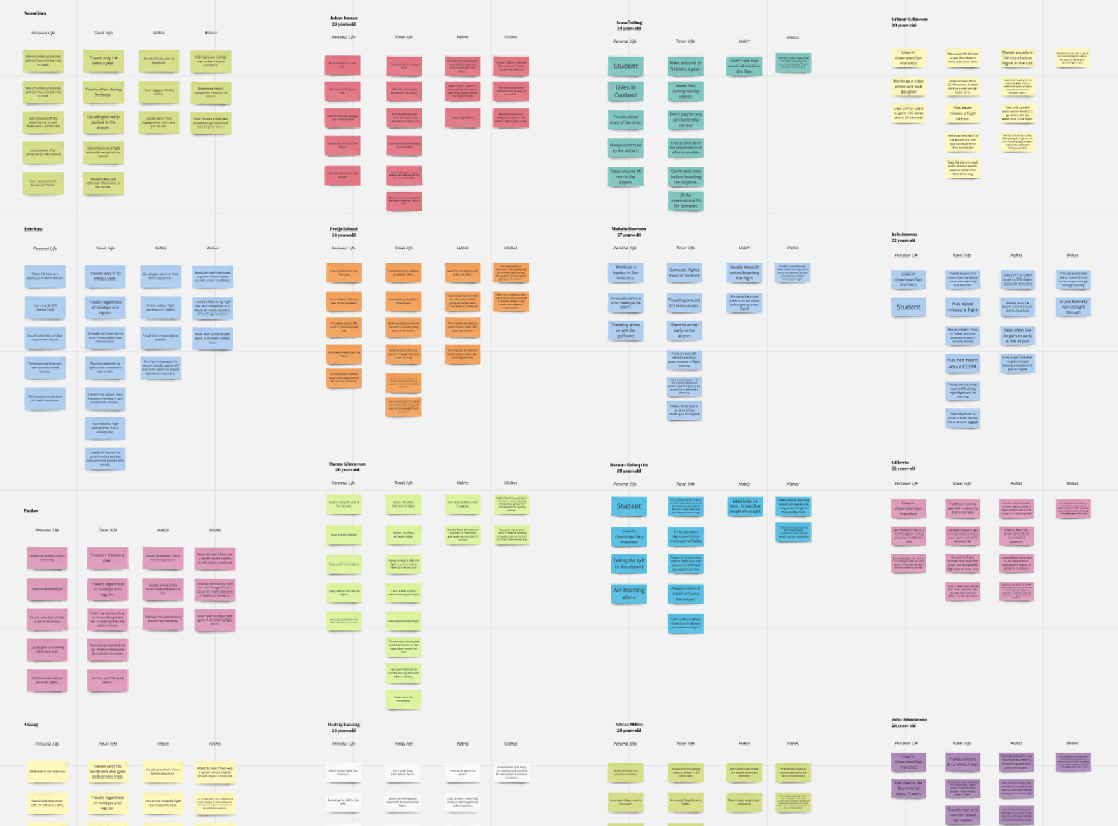
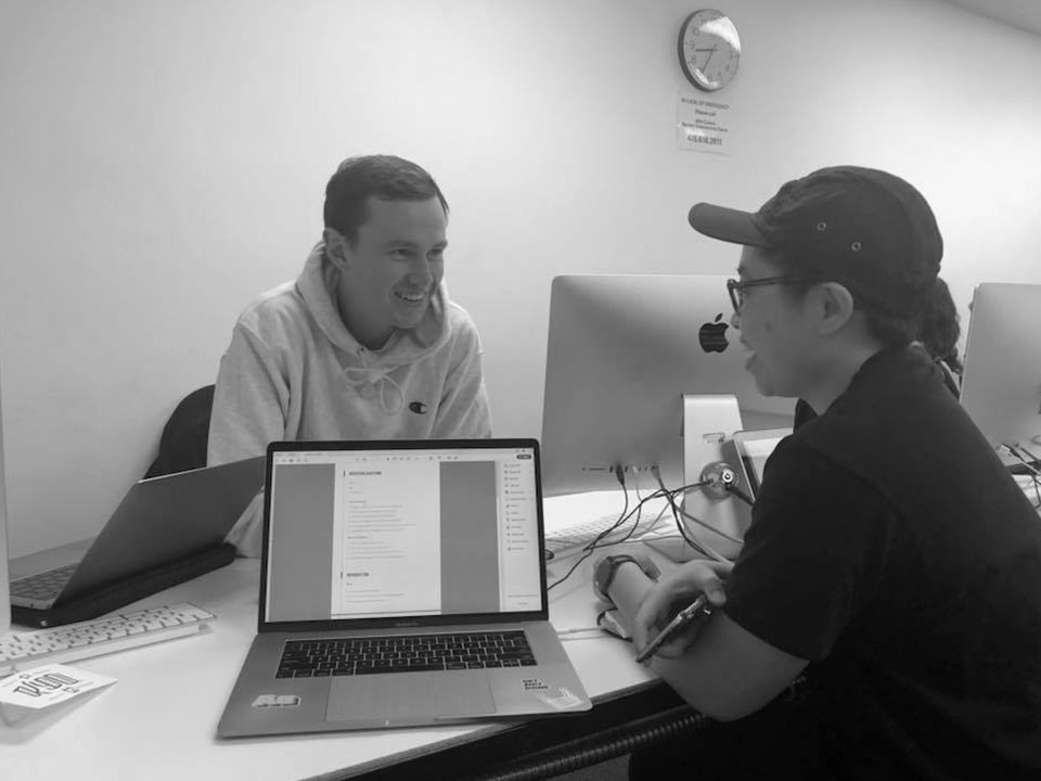
To get to know our travelers we interviewed 30 people and sent out Google survey to people living in the Bay Area. By doing this we found some very interesting statements and facts about the problem we’re solving (and yes, I did some interviews during a flight).
After our research and interviews we collected our data, synthesis and clustered everything we got and started looking for user patterns and pains our interviewees experience while traveling to and through airports. Since I worked on the research phase with 2 other UX/UI designer, we used Realtime Board to gather all of our insights together.
Key Findings and Learnings
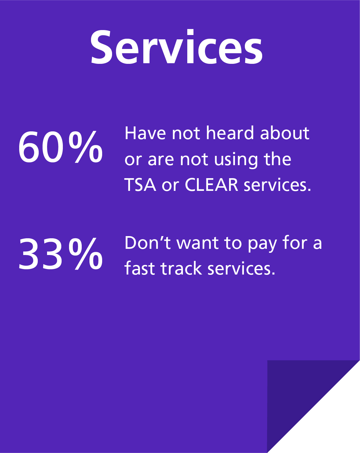
More then 50% of our participants feel stressed and anxious when they’re heading to the airport because of not knowing the line wait status.
Around 75% wish they’d have access to some information about the security checkpoints before their flights.
Almost 70% are using their phones for checking in to flights and storing their boarding passes.
What this means
Most people are open for and others in need of an assistant tool to help them get information on security time of wait at the gate they’re heading to.
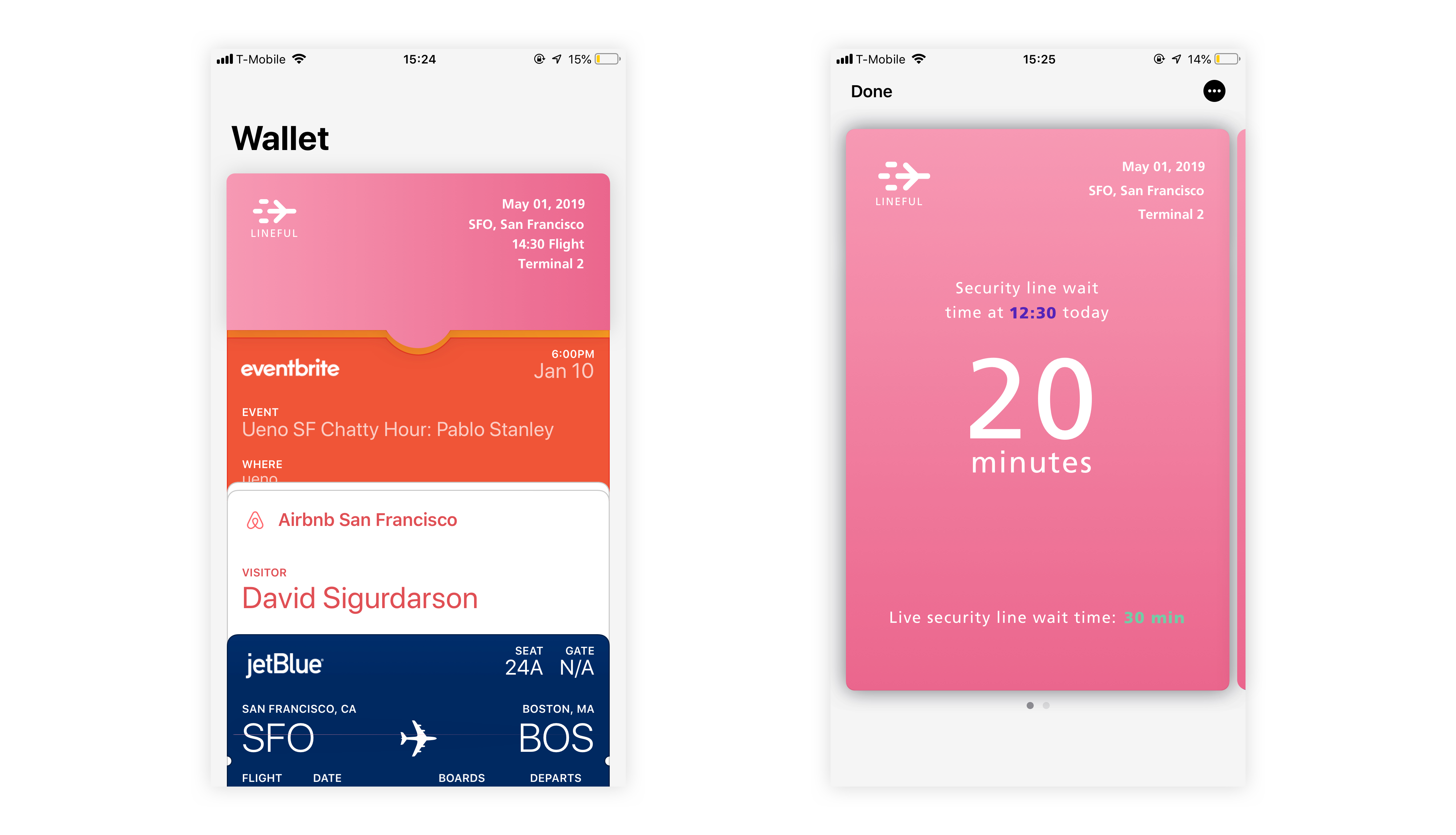
There’s definitely an opportunity to create a scalable webpage and possibly connect it with applications like Apple Wallet, since people are increasingly using their phones durin travels.
So, we started with mapping out the customer journey and the website structure.
Attention: At this point the team of 3 were asked to come up with our own final design solution.
Sketches & Low Fidelity Screens
Based on what we found and learned from the beginning to this stage, I started sketching possible features to resolve the validated issues. Based on the research, that showed increased usage of phones during travels, I decided to design for mobile first.
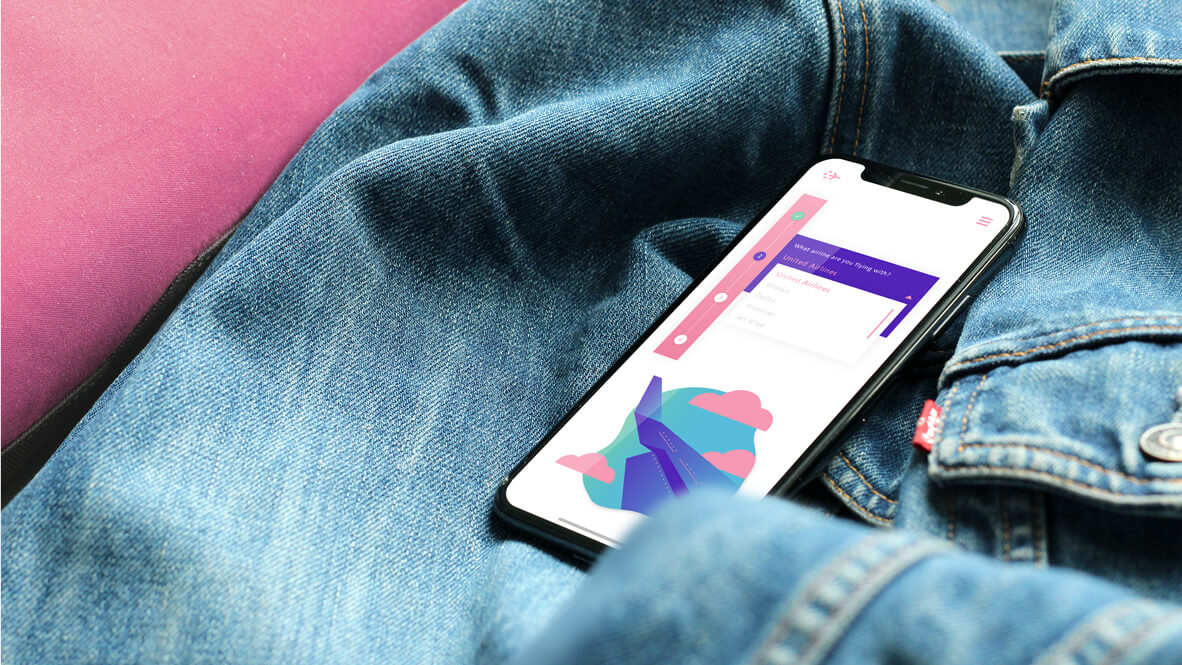
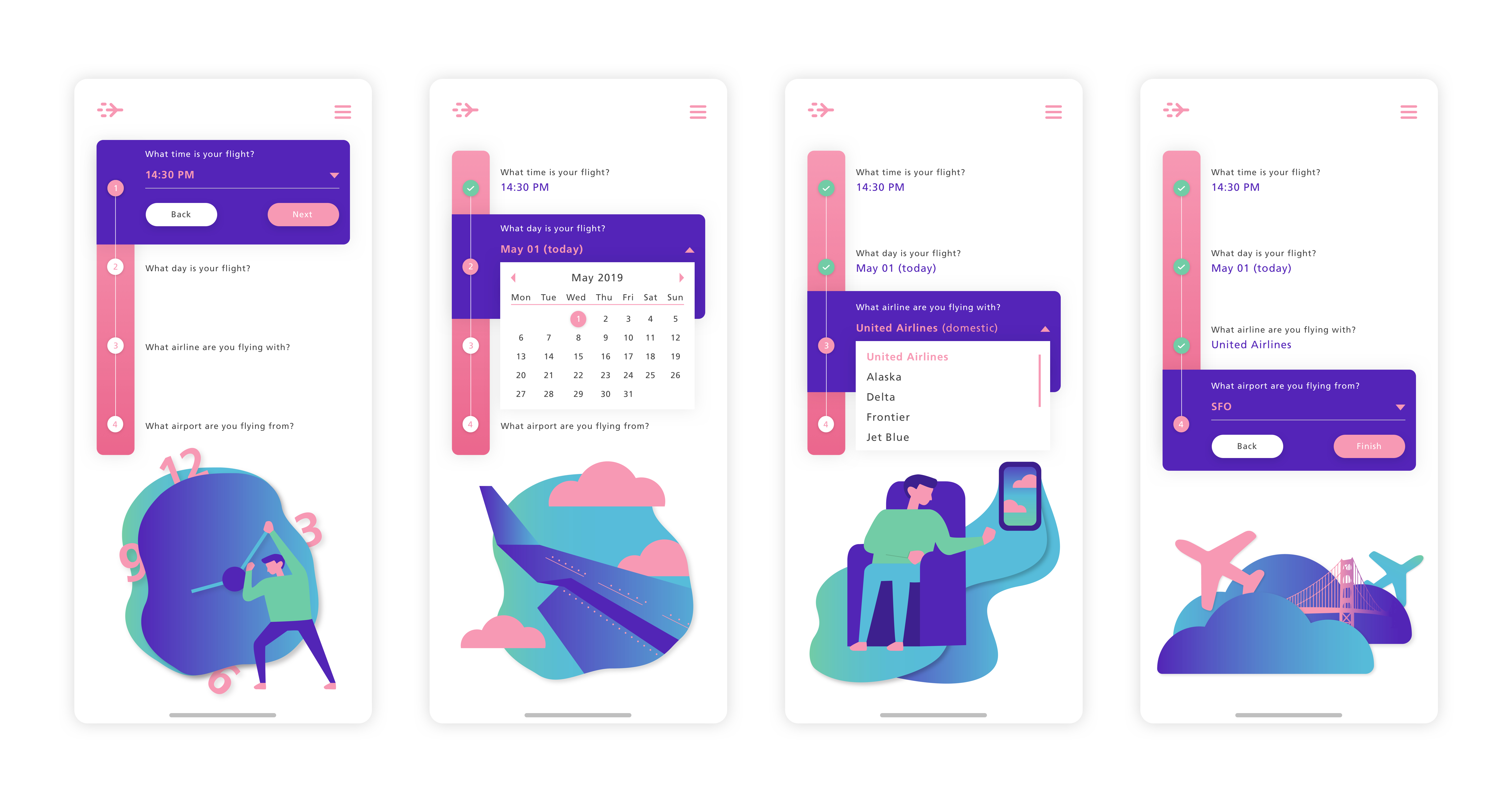
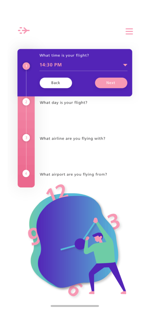
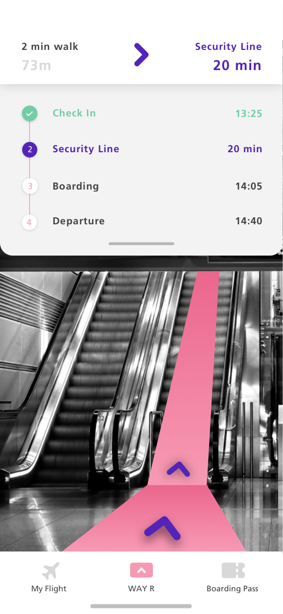
The most important feature of the web application are the"Flight Info" screens, where the user answers 4 main questions that are required so the data can calculate the wait time at a certain security gate.
User Testing
DIALING UP THE DESIGN
After dialing my designs up to low fidelity screens and started user testing. I iterated on my wireframing by conducting guerrilla usability testing with paper prototype at first and then uploaded my screens to InVision for more in depth user testing.
Clustering User Insights
DISCOVERING PAIN POINTS
There was especially one area during the user testing that users were experience misunderstanding - The "Flight Info" screens. They were actually giving people extra and unnecessary stress.
Quotes from Interviewees
DURING INVISION USER TESTING
"I don't feel good about not knowing how many questions I need to answer."
"There's way too much clicking."
"I feel like I'm starting over and over again when I get a new question."
Back to Sketching
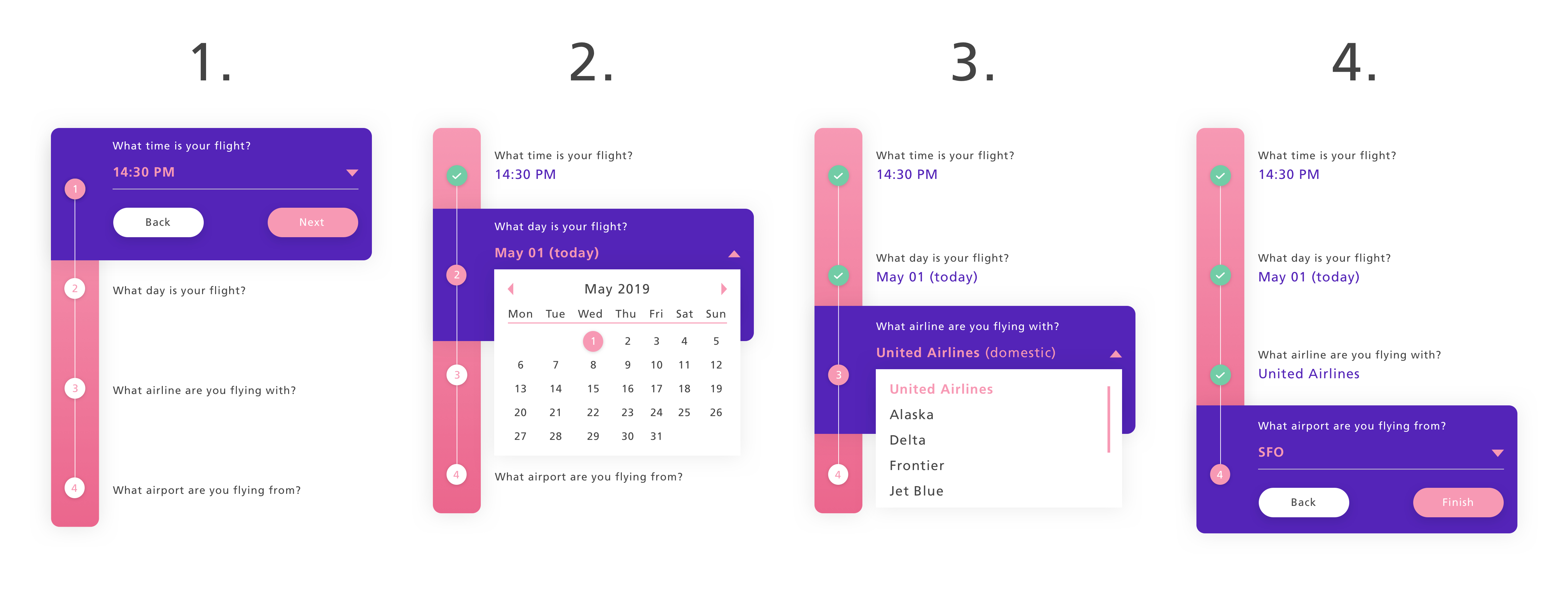
I went back to sketching and tried to figure out a more easy way for users to get through the "4 questions" screens by combining it into one.
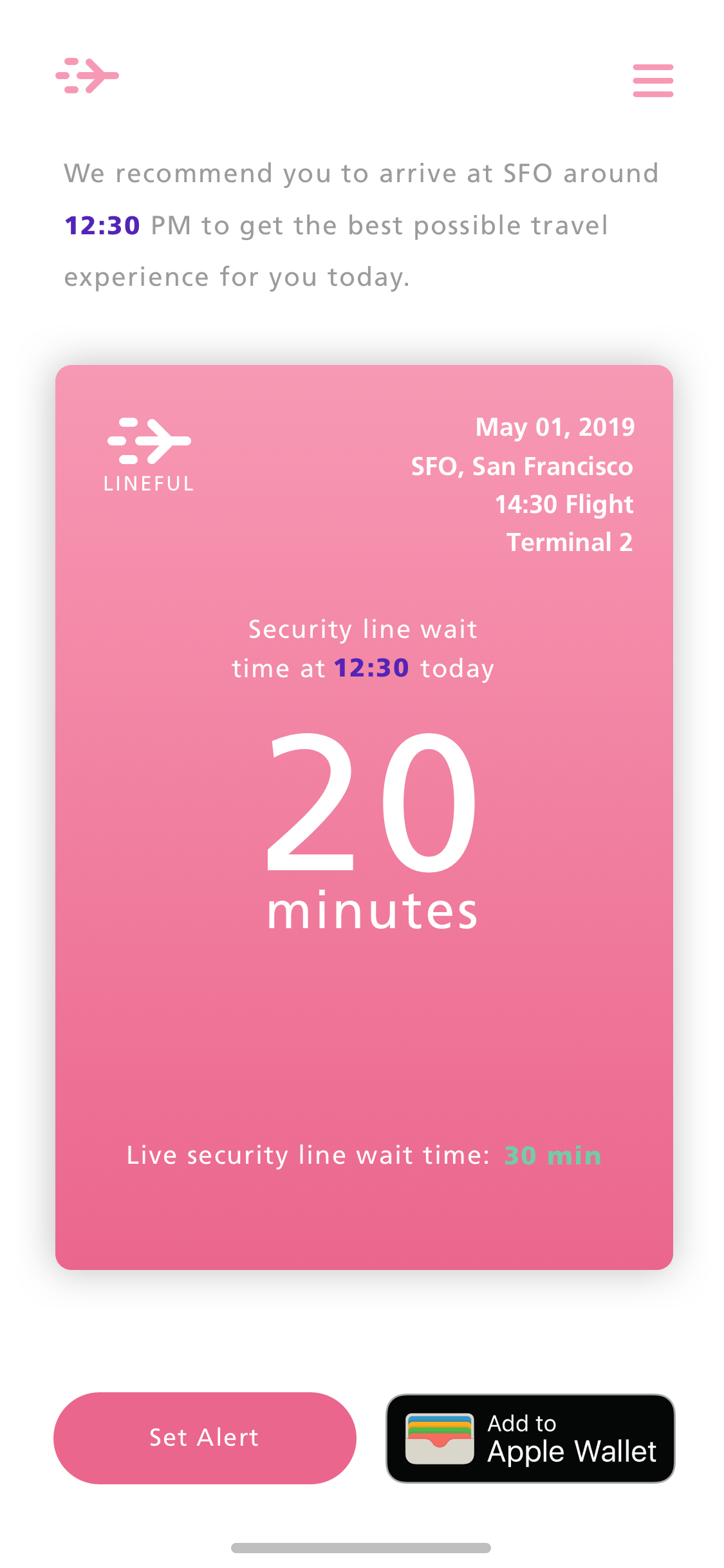
Since the end goal is eventually to add a "Lineful Card" to the users wallet, I created a different card variations to create more of a whole feeling to the experience.
Solution for "Info Screens"
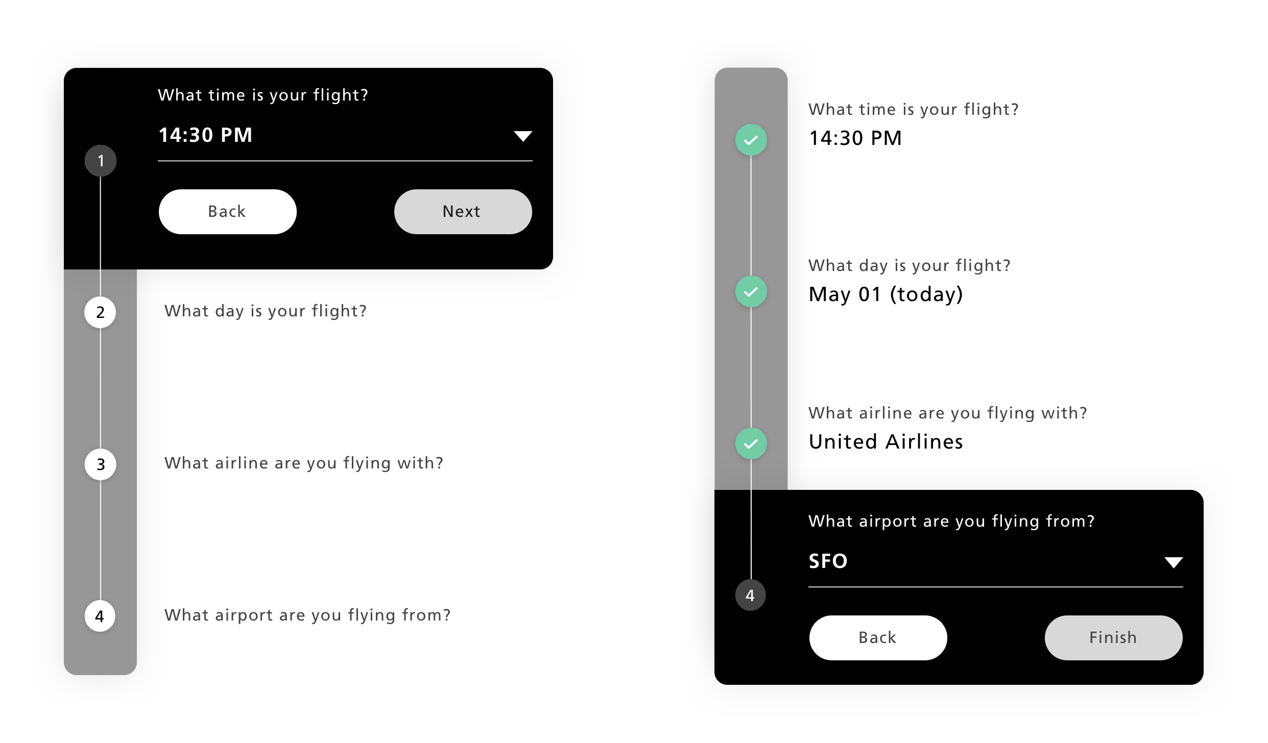
After many iterations plus second and third rounds of user testing this part, I came up with a final solution for combining the "Info Screens" into one screen.
Since the webpage is designed for mobile first I stakced the steps downwards. By visually showing how many questions there are, the user can easily identify that. By showing "Checkmarks" in green after each answered question, sparks a accomplishemnt feeling with the customer.
Design Guidelines
DIALING UP THE DESIGNS
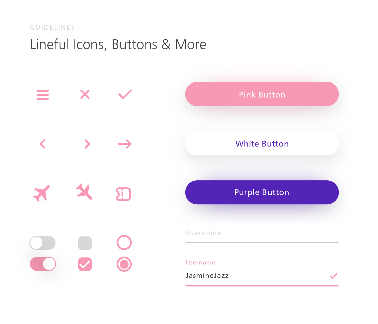
I created interface guidelines in Sketch which helped me keep the design structure on the right path thoughout the process. These were mostly reusable components that I could grab and use when creating new screens.
Art Direction
CREATING A USEFUL EXPERIENCE
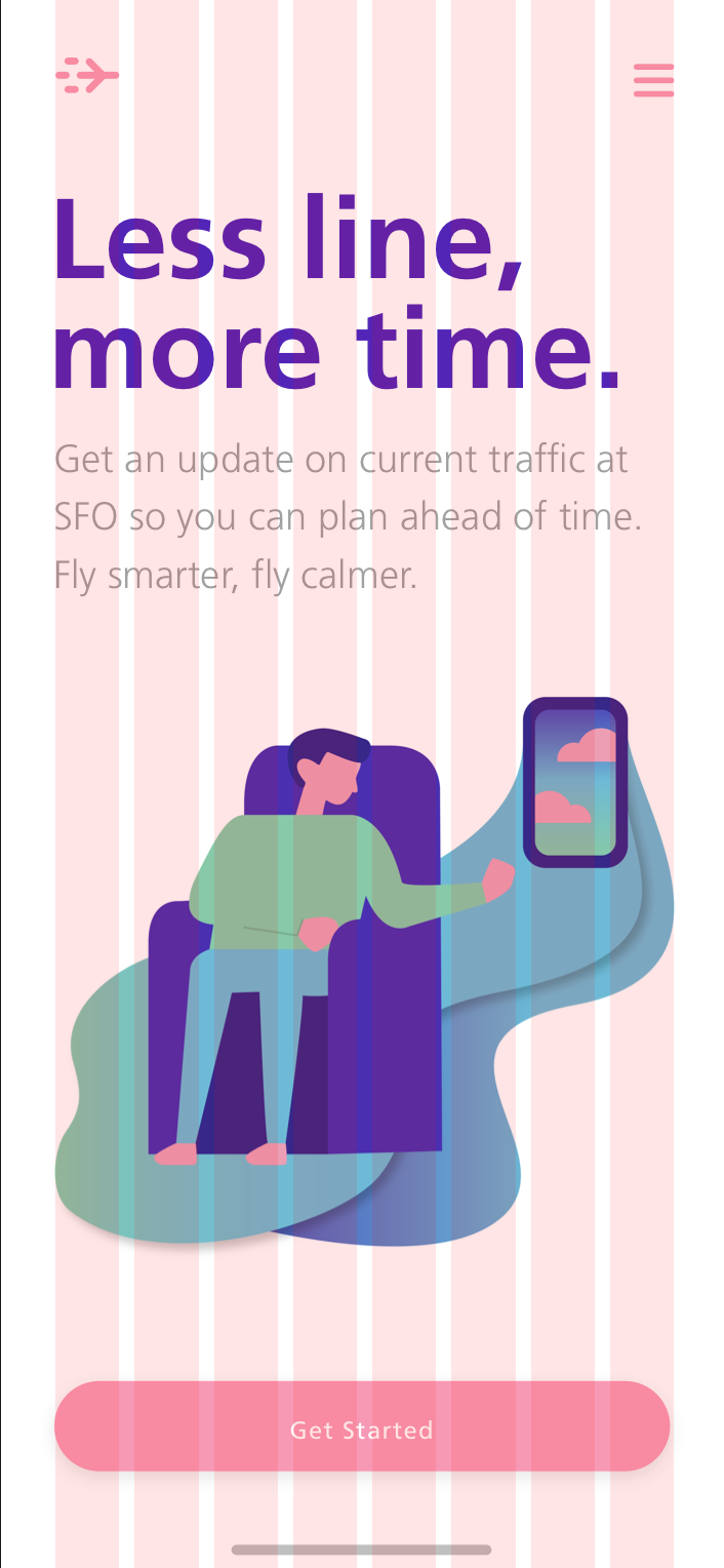
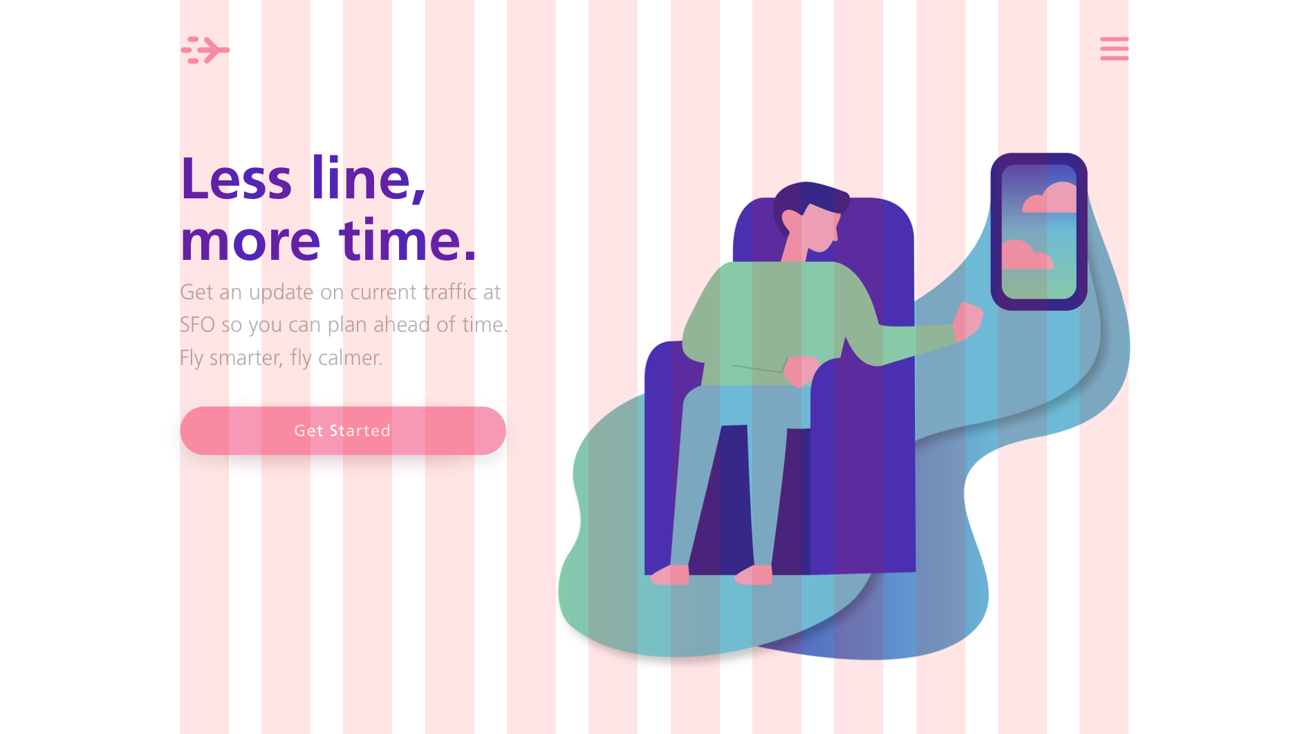
After the design guidelines were decided by most parts, I wanted to add illustrations to the web page experience to give the look and feel even more enjoyable.
Design System
USING MATERIAL DESIGN PRINCIPLES
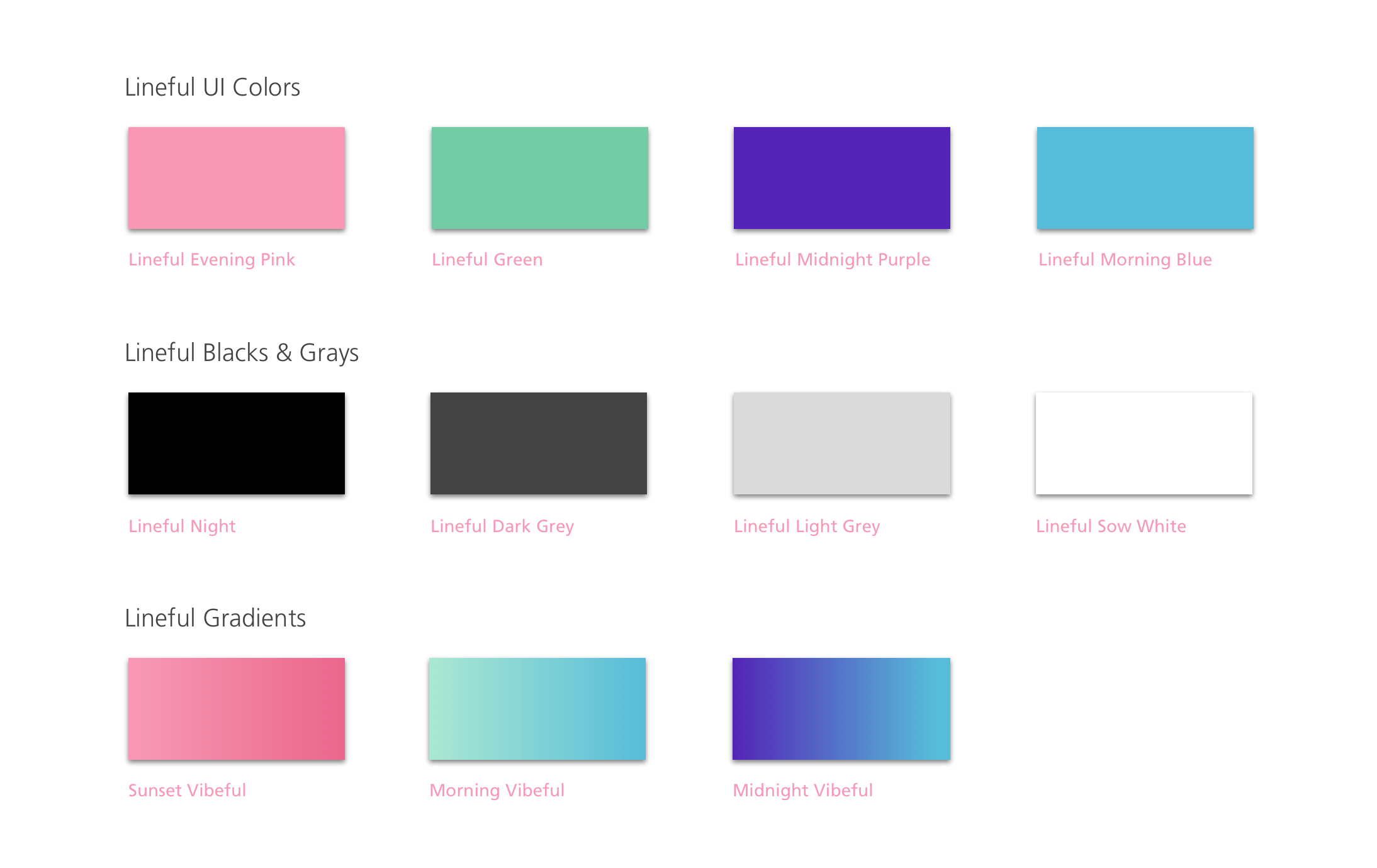
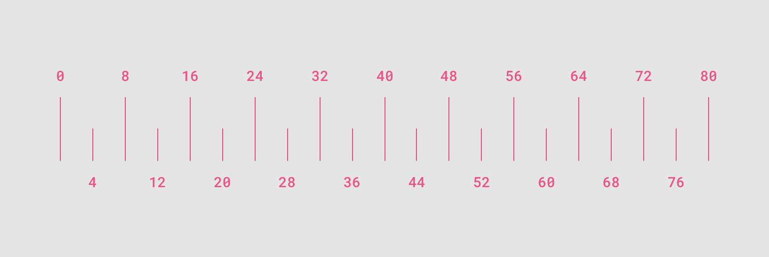
I started designing high fidelity prototypes by creating a style guide for the user interface and determining major screens of the app both for web and mobile screens since this is a web applicatios. I use material design principles so divisions of 8: 8px / 16px / 24px / 32px / 40px / 48px / 56px and so on for all padding / margin between elements. This gave the screen space a grid system where every content was placed for a reason.
Final Design
FINISHING THE FINAL STEPS
After deciding on which direction to go with the webpage high fidelity wise, I started giving the whole experience a same feeling throughout the screens.
Info Screens in motion
FILLING IN INFORMATION
Here you can see how the interaction works when a user is filling in his information, the 4 questions he needs to answer to get to his "Lineful Card".
Final "Card Screen" Design
RELATING TO WALLET CARDS
After the user has filled out the 4 questions needed to provide him the line time of wait, he receives his "Lineful Card" which gives him both them line time of wait at the time he's aiming at being at the airport as well as the current security line time of wait.
Now he can choose by setting an alert for his security gate, store the "Lineful Card" in his Wallet or both.
Things to consider
WHAT DOES THE FUTURE HAVE IN STORE?
It is quite a big question to wonder about. One aspect of the future but definitely an option to think about is the future of traveling and what technology will possibly make travelin experience easier and more enjoyable in the future. On aspect of that is possibly bringin AR into the experience, to guide travelers around the world to get through an unknown airport.
Reflection
I definitely want to create the screens for Android as well.
Next time while working with a start up/company I'd like to have more to say at the beginning of the project and be more involved in brainstorming about the beginning phases of the project.
Would it be possible to lower the numbers of "Flight Info" question from 4 to maybe 3?