Beacon

Reinventing people's parking behavior in the streets

Project Description

10 WEEK DESIGN SPRINT
Beacon is an UX/UI project focused on possibilities to improve public parking in the streets of San Francisco. I researched the local public parking and transit market space and then developed a solution to achieve the users‘ goals by understanding patterns in their targeted problems and behaviors: saving time in their busy everyday life and reducing pollutants. One study of a 15-block area near UCLA found that, in a year‘s time, motorists drove the distance between Earth and the moon four times over while hunting for parking in the streets.

Hypothesis

It sometimes takes more time to find a parking spot in the streets of San Francisco then it took driving there, causing problems for the driver and extra pollution. Parking has a dramatic impact on how a city looks, feels, and how its resident move about. People's parking situation will be improved vastly by creating parking solutions in advance for them.

Interviews and Surveys

At the beginning of the project, after brainstorming about possible product goals, creating user personas for the problem, as well as learning goals for research, I created a script to interview people about their parking experiences in the streets of San Francisco.
view interview script

Synthesis and Clustering

After doing 10 one on one interviews with car owners in the city, I represented each of my interviewees with a colored sticky note that I placed on the wall. After that I started clustering, creating topics and themes and finding user patterns.
Synthesis
Synthesis
Synthesis
Clustering
Clustering
Clustering

Quotes from Interviewees

I would love to be able to reserve a parking spot in the streets somehow or see the status in the street.
Driving home from work always gives me anxiety, usually just 50/50% chance if I'll find a spot or not.
Parking meters really are a frustrating thing and super outdated. I guess they're like 20 years old?

Findings and Learnings

  • People use street parking because garages tend to be way too expensive.
  • Drivers looking for street parking often have to circle around for 10-30 minutes and hope for the best.
  • People who need short-term parking (0.5-3 hours) want to find street parking as close as possible to their destination.
  • A lot of people think parking meters have become outdated and could be updated.

Solution

After the research, interviews, findings and learnings with my users, I created an IoT concept: an application that connects to new smart parking meters, innovating the experience of finding spots, reserving spots and parking in the street.

The Beacon Meter

REPLACING OUTDATED PARKING METERS
When a car parks in an open spot, the camera scans the vehicle license plate to run through it's data base and reserves the spot without the user having to do anything. When a unregistered car parks in a spot, the parking meter is the camera which works as a "Parking Enforcement Officer" by fining cars that are parked illegally.

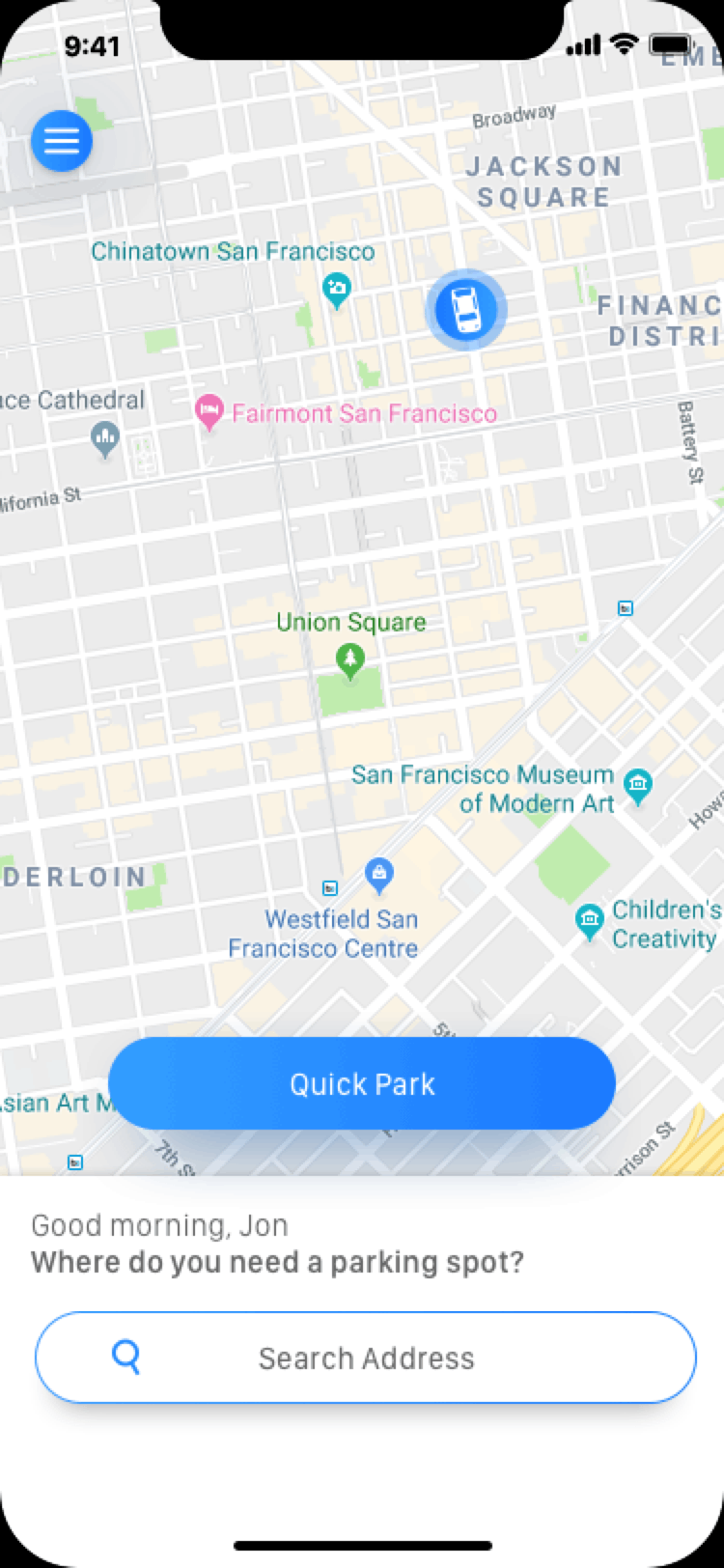
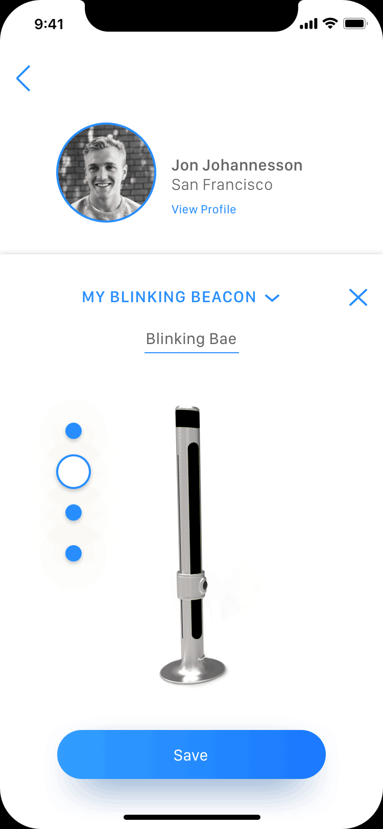
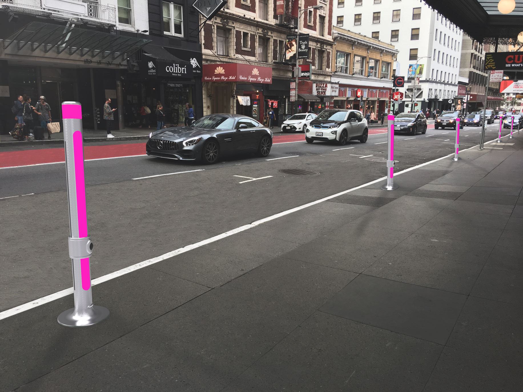
Ideate and Validation

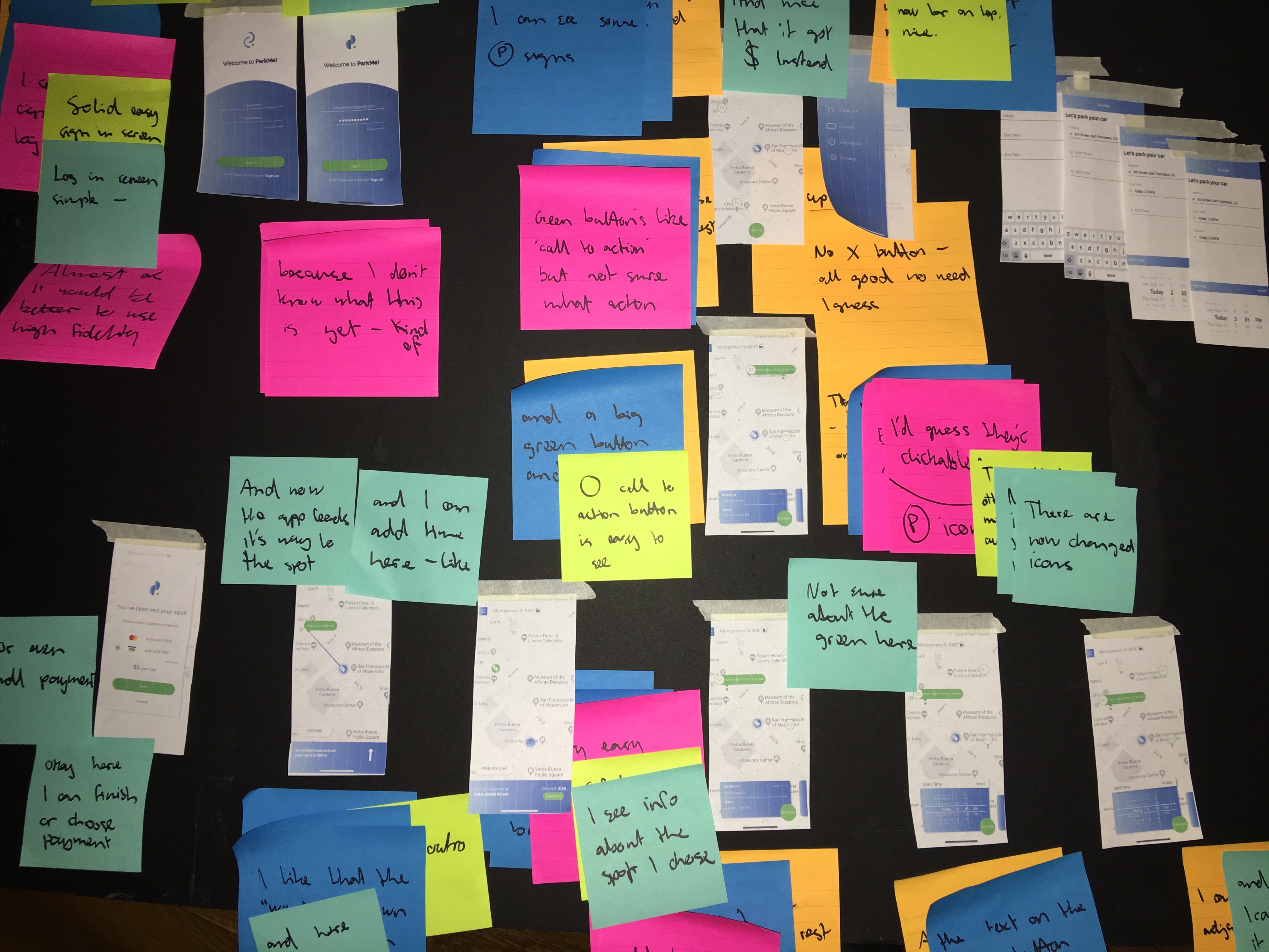
PAPER PROTOTYPE & GUERRILLA TESTING
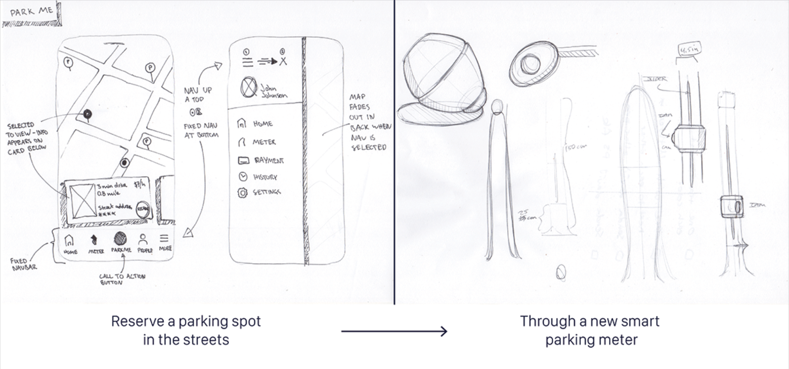
To quickly test the concept, I created low fidelity paper prototypes from my sketches that demonstrated key user flows. Paper prototype allowed me to brainstorm on main features without expending too much resources. I iterated on my wireframing by conducting guerrilla usability testing with paper prototypes. With the total of 6 participants, I aimed to validate solution concept, clarity on components, and user efficiency.

Final Design

I started designing high fidelity prototypes by creating a style guide for the user interface and determining major screens of the app. I use material design principles so divisions of 8: 8px / 16px / 24px / 32px / 40px / 48px / 56px and so on for all padding / margin between elements. That helped me to give the screen space a grid system where every content was placed for a reason. I used Sketch for UI design and then After Effects and Principle for motion design.

Design Guidelines

I created interface guidelines in Sketch which helped me keep the design structure on the right path thoughout the process. These were mostly reusable components that I could grab and use when creating new screens.

Scenario 1

FIRST TIME USER LOG IN
When logging in for the first time, the app encourages the user to add his information for a better experience later on. By doing this, the user does not have to worry about wasting extra time to deal with payments later on when reserving parking spots.

Scenario 2

USERS PROFILE
The user can navigate to his profile by clocking the hamburger menu. There he has two option, to click on "View Profile" which slides up from the bottom and gives him a summary of the information to his account. On the other hand menu items that slide in from the right such as "Payment", "Vehicle", and his Beacon color (which we will explore in next scenario). By making the menu items slide in from the right, the user does not have to dig deep into the app to find and adjust specific content.

Scenario 3

USERS BEACON COLOR
In one of the menu cards the user can choose his "Beacon Color", which will be the color of the Beacon meter, at the spot he has reserved, when the user is within the "50 meter zone" and approaching his spot. This definitely gave the product and application an enjoyable angle which 100% of my users liked and found interesting.

Scenario 4

'QUICK PARK' FEATURE
The 'Quick Park' feature lets the user reserve the nearest available spot with only 2 clicks. If he wants to explore other nearby spots, he can click "More options" and browse other nearby possibilities. The user can quickly navigate to his payment options at the bottom left corner to change or add payment methods if needed.

Scenario 5

'PREMIUM PARKING' FEATURE
The 'Premium Parking' feature allows the user to reserve a parking spot no matter how far away to the destination he is. Here, the user is not too far away from where he's going, but the app notifies him that there are only 3 available spots within 5 mintues of his destination. That's why the user decides to reserve the spot and pay extra fee – which is one key insights I found out during my testing, that people are willing to pay more for to secure a spot rather driving to the destination in uncertainty.

Prototype

CREATED IN INVISION
I created a prototype in InVision for users to click through to get the feeling for the app as well as to spot some difficulties a user might have within the app. While the users clicked through the app, I asked them to talk out load about everything they were doing and thinking and recorded it to try to find user patterns. Please feel free to take a quick test at the prototype here beneath.

Addressing the edge-case cenarios

I realized that one of the more important function of this real-time interactive app lies on solving tricky scenarios that could occur with this kind of a new product.

Scenario 1

DESIGNING FOR DISABILITY
There are many different scenarios where I'd like to research more for this project when it comes for thinking about people with disabilitiies. The first and maybe the one of more important ones that came to mind was problems that color blinded people might experience with the meters since they are based on a color system. One solution would be creating a "blinking" system with different motion versions of dark and light color.

Here the user has chosen a to have his mBeacon meter "blinking" when he's arriving to his reserved spot, instead of having a color picked.

Scenario 2

INCONVENIENCE
What if a person that isn't familiar with the new Beacon parking system, parks in an already reserved spot? At that point the app would need to notify the user that had reserved that spot, and tackle the problem by finding the nearest available spot with an offer.

Things to consider

One aspect to think about is if the meaters could be used during certain days or months the company could participate and use the meters to help bring awerness to different cultural and social movements to make their mark. For example National Breast Cancer Awerness and LGBT Pride.

Reflection

I would like to run additional usability testing in a more difficult settings to catch any confusion in complicated situations. I'm sure there are other situations that I missed because reinventing the parking meter system is a bit complicated!