Pláss

Rebrand proposal for the city of Reykjavik´s parking space department

Project Description

Bílastæðasjóður is the Reykjavik´s “Parking Space Found” and take care of all parking spaces in Reykjavik, both street parking and multi storey car parks. During my internship at Brandenburg in the summer 2018 I created a rebrand proposal after they came looking to us. The proposal included an all around rebrand such as new name and a new logo.

The Proposal

IDENTIFYING THE BRANDS PROBLEM
Bílastæðajóður, or Reykjavik´s “Parking Space Found”, has a huge customer base but even bigger customer perception problem. What they needed to do is move from being too corporate to a brand that people really want to use and not just one they´re forced to use.

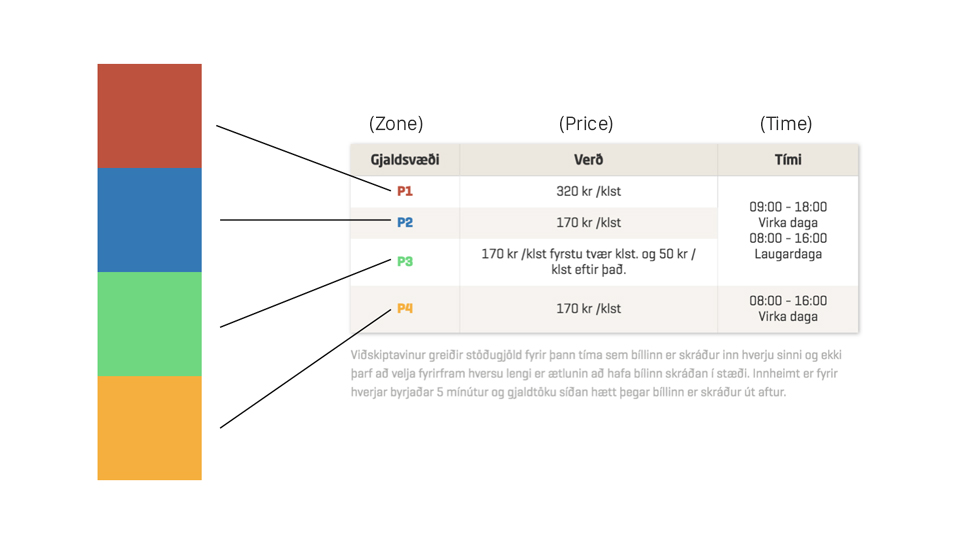
The blue color they’d used throughout their history inevitably came across as too bureaucratic — so our idea was to “open” the brand up to the main colors of the spectrum, since they were already in use in small areas of the brand (mainly to mark the 4 different parking zones). These colors related better to customers by expanding the visual range of tones and feelings.

By doing this, Bílastæðasjóður, creates a visible commitment to connect to their customers better by moving from a faceless government entity to a more personal, accessible brand.
Current logo

Design Process

After the first meeting with my art director we decided to propose a new name for the brand, PLÁSS. It´s an all icelandic word which means "space", but it was important to have a word that started with the letter P, which is the international symbol for Parking. I sketched out various versions of P – and in the end, landed on an abstract P with a parking space integrated in it.

Refining the new look

I refined the logomark and picked this kind of blue as a main color, since a blue color within a P is a unlisted rule througout the world as a color for parking. The blue we chose is brighter then the previous "corporate blue" – and harmonises with the rest of the new secondary branding colors, which you can see here beneath. These new colors were proposed to be used more efficiently through the brand, with the main focus to mark the four different parking zones througout the city.

Animating the new identity

After brainstorming what direction the new brand identity could look in motion, I threw the new logo into After Effects and created few different versions of how it could be presented in digital media.