Gláma Kím

New website for an Icelandic architect company
view website

About

After pitching an idea to Gláma Kím, a architect company in Iceland, I was hired to redesign and code few different pages for their website. Gláma Kím hadn’t updated their website in quite some time which had become too static for the today’s industry. The number one priority was to focus on the landing page, the first experience the audience see when they enter the website.

Research, Idea & Pitch Website

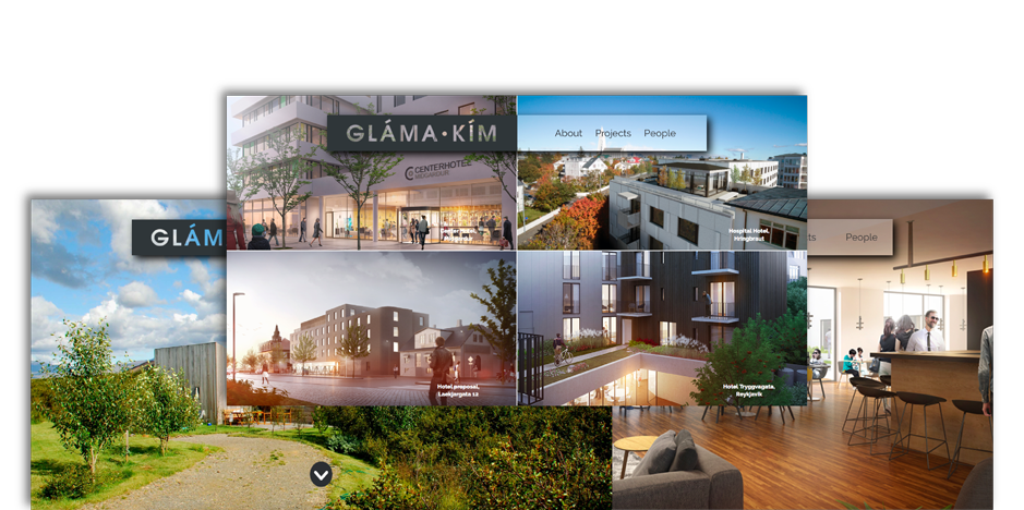
After doing research I found out that people searching for architects on the web want to see big HQ images of previous works and less of text. I designed and built a website to present to the people at Gláma Kím. It was important to have a lifely landing page to delight the user, as well as big and pleasing images when showing their projects.
view pitch website

Current Website

The concept of the current website is the same as my presentation one but combined with elements from their previous website, such as their header and nav, with some adjustments.

User Friendly

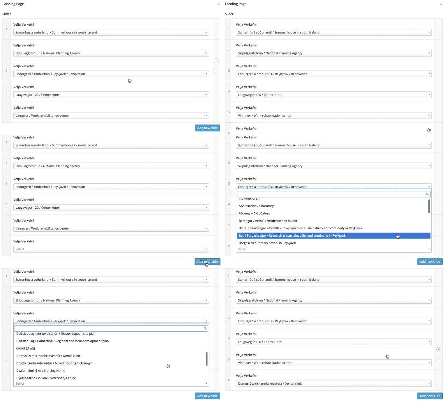
After designing the landing page I had to figure out how to make it a user friendly process for the staff at Gláma Kím to update the home page of the website anytime they had a new project to show. Through a custom made Wordpress theme, it now only takes them few seconds to upload their newest project every time to their website. The number of projects they can have looping is endless, but as of now they have their 5 newest ones.
view website